A photographer or videographer must know a great deal about colors and color theory in general to compose outstanding images, photos, and videos, and color saturation is one of the many color parameters you can adjust to improve and alter the mood of a raw photo or footage.
Photography and Videography enthusiasts and professionals alike can adjust the color saturation differently during editing and shooting techniques. However, the key is knowing when to use saturation. Whether you increase or decrease color saturation, the effect on your image will depend on your vision and creativity.
Saturation is essential in photo and video editing, but to use it effectively, you must learn the basics of color saturation. This article explores the basics of color saturation and how it can be used in photography and videography to create beautiful, natural images or exciting, mystical images.
Understanding saturation can add uniqueness to your photos and videos once you master it.
Let’s dive in!
What is Image Saturation
In simple terms, color saturation defines the color intensity; it expresses how bright or dull the color is. An image with low saturation will look greyish and somber, lacking colors. An image with high saturation will have more vibrant colors and a more joyful vibe. However, too much or too little saturation can affect the image's composition.
When we talk about colors, we can describe them using three concepts: Hue, Saturation, and Lightness, also known as HSL. Hue refers to the basic colors in the color wheel, the dominant colors. Saturation describes the intensity of the colors or hue in the image. Lightness determines how dark or light the hue is.
Let's look at an example to understand saturation. Remember that saturation is the intensity of a color. If you take an image into your photo editor, go to your HSL settings, and decrease the saturation sliders, you’ll have a black-and-white photo.
On the contrary, if you increase all the saturation sliders, the colors in the photo will be more intense, sometimes too intense to be perceived as real, especially skin tones.
Color saturation can help you achieve the desired result in your photos or ruin them. To achieve uniform saturation in your brightness, you need to consider all the elements in them, the color, and how the ambient light affects the tonality of your subject. You also need to have knowledge of color theory.
The Importance of Color Theory
Color theory is a tool in every photographer, videographer, artist, and designer's toolbox. It allows you to choose the right colors and combinations to create the best images that convey the message, emotions, and feelings you want to evoke.
While diving into color theory will require another full article, I want to mention two concepts that will help you understand saturation: the color wheel and color space and their importance in creating saturated colors.
-
Color Wheel
The color wheel is a circle that illustrates the organization of the hues. It shows how the colors of the primary, secondary, tertiary, etc., interact and the combinations that can be made.
-
Color Space
Color space refers to an organization of colors. These color spaces provide a uniform and standard reference for how we perceive colors and how our monitors display them. The two most common color spaces used in digital photography are RGB and sRGB.
How Saturation Works on a Photo or Video
So far, you know that decreasing saturation can turn a colorful image into a gloomy photo. If you add saturation, it can make an image more vibrant, happy, and cheerful. However, you need to be careful when using saturated colors.
Saturation can be used in photography and videography for different creative purposes. By playing with the saturation levels in an image, you can highlight the subject in your photo. You can increase saturation to make a natural image look fresher or decrease it to create a vintage photo.
Most editing apps include a saturation slider you can adjust. However, many third-party plug-ins offer creative ways to use saturation in your photos or combine it to get interesting results.
Some people find over-saturated images to look unrealistic, but depending on your goal, the effect may work for you. To avoid unintentionally oversaturating your images, you can use the histogram, a tool used by most photo editors and digital cameras.
The histogram allows you to see the tonal range in your photos and monitor the image's saturation, exposure, and tonality. A spike in color means that it's over-saturated, so you can track how much to decrease or increase the saturation value. The histogram will help you make photos and videos more balanced in colors.
How to Apply Saturation Effect with BCC Selective Saturation
Now that we’ve discussed saturation and how to use it in your photos, I’ll show you how the BCC+ Selective Saturation effect can help you enhance your photography.
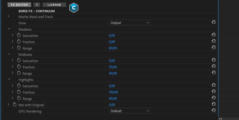
BCC+ Selective Saturation is a saturation effect by Boris FX, which is part of the Continuum plug-ins. It stands out from other saturation effects by allowing you to adjust the color saturation in the shadows, midtones, and highlights independently, giving you more control than applying saturation to the whole image.
First, you’ll need to download and install Continuum. You can follow this tutorial using the fully featured free trial (with a watermark.)
-
Step 1: Download and Install Continuum

After downloading and installing the Boris FX Hub, install Continuum for your preferred software. Continuum is supported in After Effects, Premiere Pro, DaVinci Resolve, Final Cut Pro, and more.
NOTE: For this example, we'll be using Adobe Premiere Pro, it will help us get the job done due to its compatibility with Continuum.
-
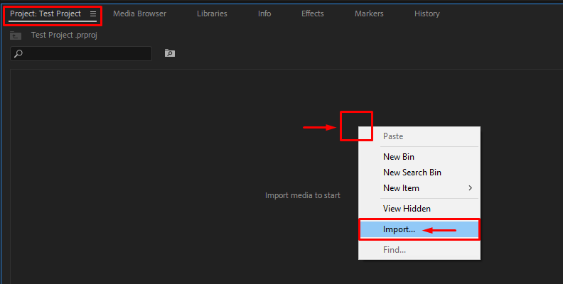
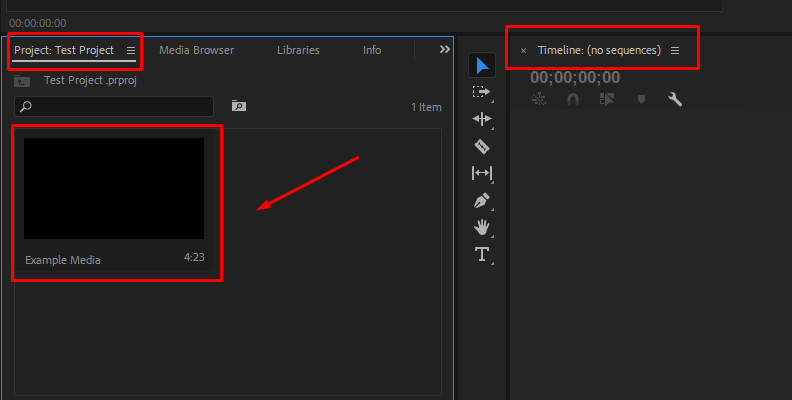
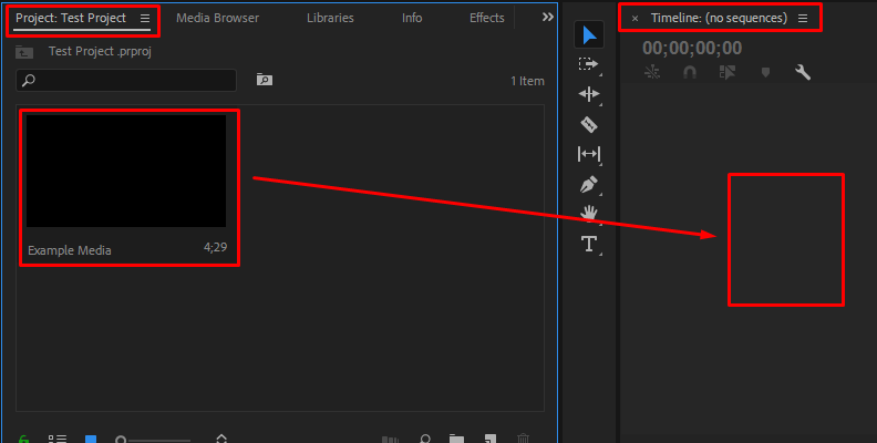
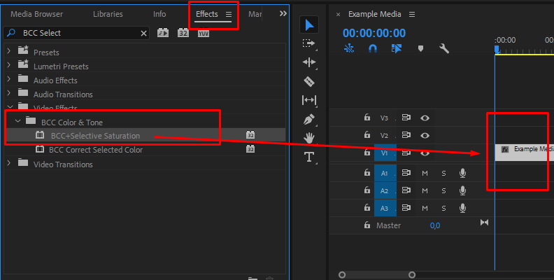
Step 2: Setting up Your Project
Create a project on your preferred software and import the photo you wish to edit saturation. Drag the image to your timeline or create a new composition.
-
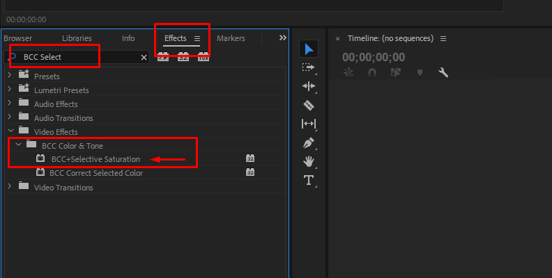
Step 3: Apply BCC+ Selective Saturation
Go to the effects library in your software and search for BCC+ Selective Saturation. You can find it under the BCC Color and Tone category. Drag the effect to your photo/video or double-click on it to apply it to the selected image.
-
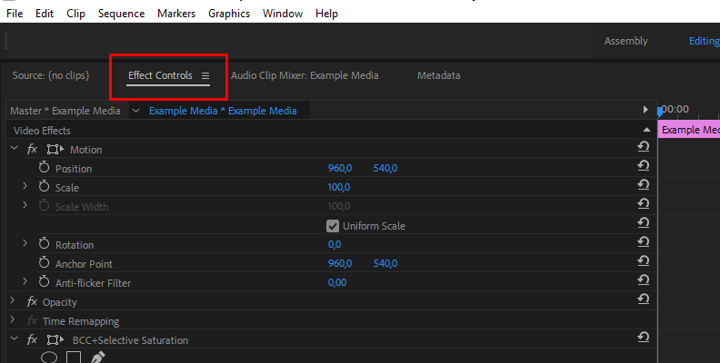
Step 4: Open the FX Editor
Once the effect is applied, you should be able to see its parameters in the effects controls, settings, or inspector, depending on your host application. At the top, you will see an FX Editor button - click on it.
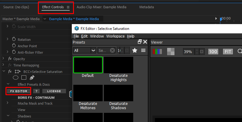
In the next window, you’ll find a few presets you can quickly try on your photo, parameters to adjust, the viewer, and a histogram. If you don’t have any of these panels on your FX Editor, you can enable them in the Window menu.
-
Step 5: Try Presets First
Try some of the presets that Continuum provides first. You will find some specific to desaturate or saturate the highlights, midtones, and shadows. Just click on one preset and look at it in the preview window. You can enable the comparison view modes. There are four modes: side-by-side comparison, vertical split comparison, horizontal split comparison, and A/B comparison.
-
Step 6: Manually Adjust Saturation
You can change the presets or manually adjust saturation from the start by going to the parameter panel on the right side. The shadows, midtones, and highlights have independent saturation sliders.
-
Step 7: Adjust the Shadows, Midtones, and Highlights Mattes
The BCC+ Selective Saturation uses an autogenerated matte for the shadows, midtones, and highlights. You can preview the matte by changing the view to shadows, midtones, or highlights. It will display the current matte, which you can adjust using the Position and Range values.
The Position defines the values used for the matte and the Range, which of these values are considered shadows, highlights, or midtones. Return to the Output view to continue adjusting saturation.
-
Step 8: Apply Settings and Return to Your Host
Once you’re done adjusting the photo saturation, click Apply in the bottom left corner to apply all the saturation adjustments and return to your host. If you don't want to try the presets, you can also display and adjust the saturation slider for each parameter from your host effect controls.
-
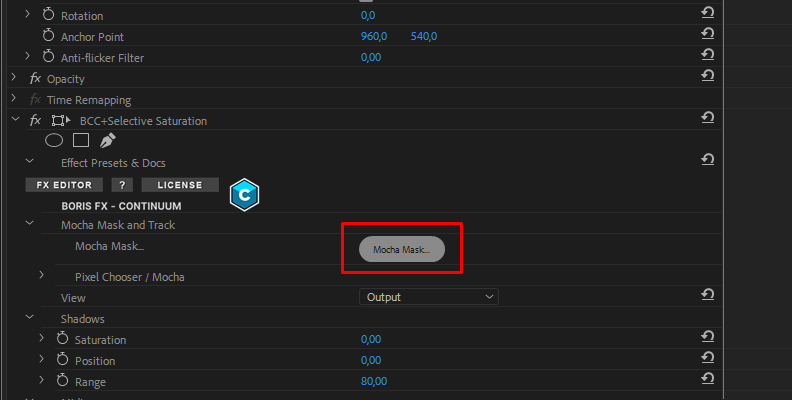
Step 9: Using Mocha Masks
Another feature of every Continuum effect is the possibility of masking and tracking using Mocha. Click the Mocha Mask button to launch Mocha.
Use a spline to draw a mask around the element to which you want to apply or track the effect. Save the changes and close the window to return to your host.
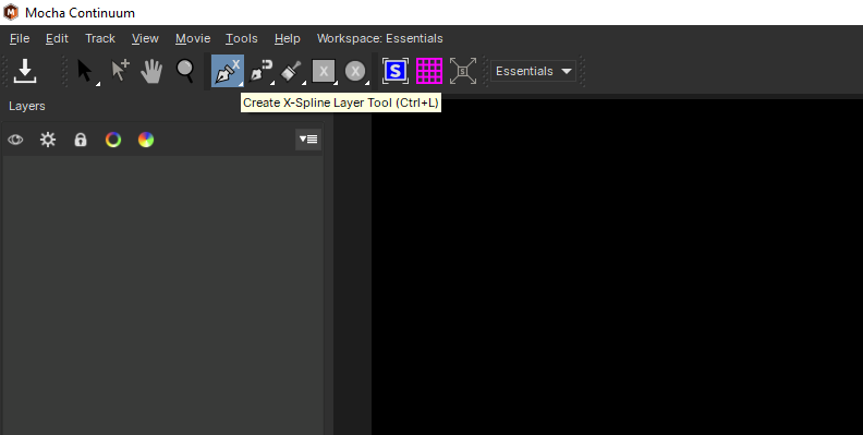
Now, you can adjust your mask settings under the Pixel Chooser/Mocha parameters on your effects control.
How to Change Image Saturation
There are several ways to change image saturation. Not all of them require external software or hardware, but some do. These are the most common.
-
Method 1: Saturation Adjustment in the Camera Settings
You can adjust the saturation in your camera settings. Depending on your camera’s brand, you most likely have a Picture Style option where you'll find the saturation, brightness, contrast, etc.
You can adjust the saturation slider from these settings to match the effect you’re trying to obtain. You can also select preset modes such as vivid, landscape, etc. Try them all to see which one fits your aesthetic. Just remember that it would only work with non RAW formats. For RAW, you can use any of the other methods.
-
Method 2: Adjust Saturation with Lens Filters
Using different lenses for your camera can change your shots' saturation, contrast, and overall composition. Try coated lenses such as polarized and anti-flare. The quality of the glass in the lens can also affect the color, contrast, and saturation of your photos.
-
Method 3: Adjust Saturation with Image Post Processing Software
Editing software has been the standard for adjusting colors and saturation in digital photography and videography. Every software program, even mobile apps for those shooting on their mobile phones, has a saturation slider you can adjust to decrease or add higher saturation.
Vibrance vs Saturation: What is the Main Difference?
If you have used tools like Adobe Lightroom, you may have noticed a Vibrance slider with Saturation. As you already know, saturation controls the intensity of the colors in the entire image. Unlike saturation, the vibrance slider adjusts saturation in a different but smart way.
Vibrance focuses on enhancing or muting colors that need boosting. It also protects skin tones from being oversaturated. If you work with people, vibrance might be a better tool to try first.
So, in summary, saturation adjusts the intensity of color in all the images indiscriminately, while the vibrance tool acts only on what needs to be enhanced or attenuated.
Final Words
Saturation levels vary from photo to photo, and there is no secret value that works for every image. Using your color theory and saturation expertise, you can make the most of your compositions. Remember to find a balance to avoid transforming a good photo into a dull image or adding too many saturated colors to your photos, which could ruin the original image.
Using tools like BCC+ Selective Saturation allows you to better control how you want to apply saturation to your photos in the shadows, midtones, and highlights independently. You can also use the mocha masking tools to add saturation to a specific subject.
FAQ
What is the saturation value of an image?
The saturation value defines how intense or strong a color is. A high saturation value in an image presents color more vividly, while low saturation values showcase dull photography or even resemble a black-and-white photo.